Data visualization
Make the evidence clear.
Show the comparison. Label it directly. Give the data room to speak.
Less decoration. More information.
Use Axia throughout. Keep labels sentence case and close to the data. Graphite leads; Baltic supports; orange highlights one meaningful point.
01 / Start with the questionChoose bars for comparison, lines for change, and a stacked bar for composition.
02 / Keep the frame quietLight gridlines, generous space and no heavy chart boxes.
03 / Make meaning explicitState units, period and source. Do not rely on color alone.
Compare without distraction
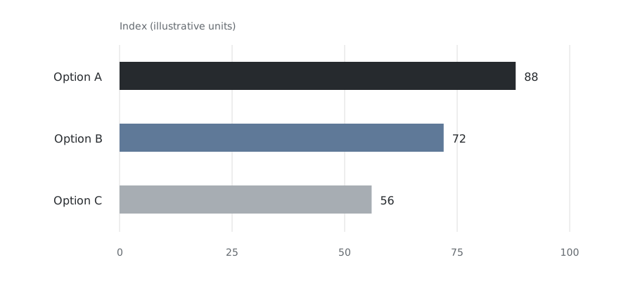
Start bars at zero. Use a common scale and put each value beside its bar.
View example data
| Option | Index |
|---|---|
| A | 88 |
| B | 72 |
| C | 56 |
Let the line tell the story
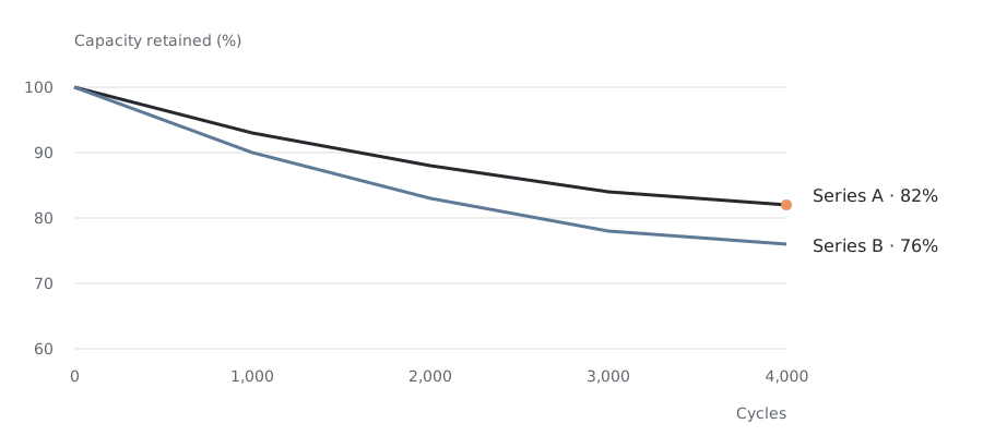
Label the series at their endpoints. Keep annotations outside the plot.
View example data
| Cycles | Series A (%) | Series B (%) |
|---|---|---|
| 0 | 100 | 100 |
| 1000 | 93 | 90 |
| 2000 | 88 | 83 |
| 3000 | 84 | 78 |
| 4000 | 82 | 76 |
Show the whole, then the parts
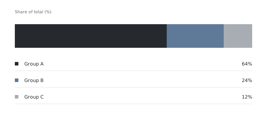
A single stacked bar keeps the proportions clear. Align labels and values below it.
View example data
| Group | Share (%) |
|---|---|
| A | 64 |
| B | 24 |
| C | 12 |
Explore the evidence
Compare series, narrow the cycle range and inspect individual readings. Keep the scale stable as the view changes.
Illustrative data · not product specifications
Capacity retention
Move across the chart or use the slider and arrow keys to inspect each reading.
Interaction should answer a question. Keep units and scales visible, provide a reset, and offer the same information without hover. See the full example data table.
Property–market fit matrix
Use a tinted matrix to compare multiple options and criteria. Group related columns and use three clearly defined levels. Hover or use the keyboard to focus a row or column.
Engineered for the properties your application demands
A multi-variable comparison with grouped criteria and three levels of fit. Hover or focus a segment or chemistry to explore the row or column. Ratings demonstrate the presentation; they are not a verified product specification.
View matrix example data
| Chemistry | Low voltage | ESS · Long duration | ESS · Frequency regulation | Defence | Commercial vehicles | Passenger cars |
|---|---|---|---|---|---|---|
| Altris | Higher | Higher | Higher | Higher | Medium | Medium |
| Polyanionic compounds | Medium | Higher | Medium | Lower | Lower | Lower |
| Layered oxide | Higher | Higher | Medium | Medium | Medium | Medium |
| LFP | Medium | Medium | Lower | Lower | Higher | Higher |
| NMC | Medium | Medium | Lower | Lower | Lower | Higher |
Before you publish
Keep charts consistent with the evidence, not just the brand.
- Replace illustrative data with verified figures and name the source.
- Show units and explain the test conditions when they affect interpretation.
- Use the same scale for comparable charts. Mark any non-zero or broken axis explicitly.
- Use target bands only when needed; place their label outside the plot and cite the target.
- Check the smallest intended size. Keep a readable data table available for digital charts.